Since opening its doors in 2012 on Newport Place in London’s Chinatown, the Chinatown Bakery has become known for its authentic Hong Kong-style cakes and pastries. The business has grown since then to two more sites on Wardour Street, Soho and supplies over 50 supermarkets and restaurants with their products. The business turns over £10M a year and employs over 120 people.
However, with plans to grow to 20 locations by 2030, the brand faced a big problem: landlords weren’t taking the business seriously. Despite its popularity and profitability, the existing branding was seen as outdated and lacked the modern appeal required to secure prominent high street locations across the UK.
Therefore, Chinatown Bakery partnered with YellowFin to deliver a comprehensive brand transformation — one that would honour the bakery’s cultural roots whilst appealing to a wider, more Western audience.
Brand Messaging
The new brand is centred around the tagline: “A Taste of Hong Kong in Every Bake.”
This line encapsulates the blend of heritage, authenticity and freshness which defines the business — designed to resonate with both loyal customers and new audiences discovering Hong Kong-style baking for the first time.
Visual Identity
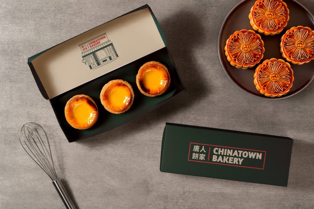
At the heart of the rebrand is a bold new visual identity which balances cultural authenticity with a more modern look and feel. The refreshed Chinatown Bakery logo is a clean, all-caps wordmark set in a rounded sans-serif typeface — striking yet approachable and designed for high visibility on busy UK high streets.
YellowFin also created a distinctive illustration inspired by the original Newport Place bakery. More than a decorative item, it serves as a reminder of where the story began — a humble shop in the heart of Soho which grew into a much bigger business.
Brand Story
The new narrative puts Hong Kong front and centre — reflecting the bakery’s inspiration from traditional Hong Kong bakeries. The messaging is now more defined and unified than previously was the case.
Packaging
With over 80 unique products, packaging had to be both functional and brand-consistent. The packaging carries forward the new logo and the shop illustration, making every box and bag instantly identifiable. Clean layouts and bold typography create clarity in busy retail environments, while the new colour palette adds a sense of richness and quality. Chinese patterns are used on the gift boxes to make them stand out and feel more special than the everyday items.
Website
The new website supportsthree key functions:
· An engaging digital storefront
· A platform for wholesale enquiries and repeat orders
· A destination to drive footfall to physical locations
The site reflects the new brand design and messaging, combining clarity, style, and performance across all devices.
The rebrand brings together the heart and heritage of Chinatown Bakery with a fresh, professional identity ready to scale. From its visual language to customer touchpoints, the new brand sets the stage for national growth — while staying true to the business’s Hong Kong roots.
“This new identity feels like us — just evolved,” says founder Simon Tang.
“We’re still making the same great products, but now we’ve got a brand that truly reflects the quality and vision behind them.”


